
How to design a delicious-looking strawberry using just one layer
Learn how to create a one-layer masterpiece directly from our design challenge winner, David Blum
Author
A couple months ago, Sketch challenged us to create a unique design using just one layer. While freedom is great to explore and go wild, it’s fascinating how constraints can help us push creativity in so many interesting ways. In this challenge, I’ll show you how I used a single layer and tons of gradients to create a juicy and delicious-looking strawberry — this is the perfect tutorial to level up your gradients game and get comfortable designing more with less.
Before we dive in, here’s a quick look at the final illustration. Feel free to come back to it at any point in the tutorial to keep track of your progress!

There’s more to the strawberry than meets the eye, so don’t feel pressured to go through the whole tutorial in one go! Bookmark it for later 😉
Let’s get started!
1. Create an Artboard
First things first, let’s set up our Artboard — this will help us define the size and shape of our strawberry. Press A to create an Artboard, click anywhere on the Canvas and drag until you’re happy with its size. In this case, we’ll use 1200x860 px as our dimensions.

2. Draw the strawberry shape
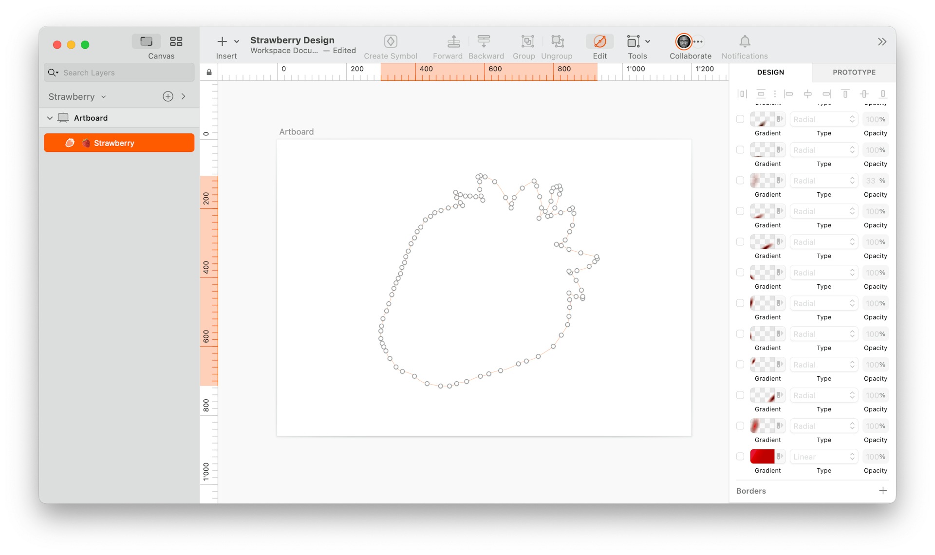
Press V to enable the Vector tool and start drawing the outline of your strawberry. Click anywhere on the Canvas to create points around the shape, and curve the lines by dragging the handles. Don’t worry about making it perfect, strawberries come in various shapes and sizes!
However, since we are only working with one layer, make sure to draw the leaves and the stem as part of the same path. Alternatively, you can draw them separately and then merge them into one layer using Layer > Combine > Union in the menu.
3. Add the base gradient
Now that we have our shape, let’s give it some color. Head to the Fill section in the Inspector and add a linear gradient. In our case, we’re starting with a lighter red #E81436 and then gradually making it darker using multiple color stops like #E50000, #D20000 and #BF0000.

As you can see, I’ve made sure the gradient stops only go as far as half of the strawberry’s width.
4. Create depth with shadows
Time to bring some depth to our strawberry using shadows — we’ll use multiple radial gradients stacked on top of each other. Play around with the placing of the shadows until you’re happy with how it looks.
Use multiple stops, between three and four, on each gradient and make sure to bring down the alpha value (opacity) progressively for every stop. For example in the case of some of our gradients, our first stop has an alpha value of 100, the second stop of 99, the third stop of 44 and the last one of 0.
You’ll find that the logic is the same throughout the whole tutorial: your first gradient stop should be the most opaque and the last stop should always be set to 0. In this case, I combined #590000 and #710000 and lowered their alpha value progressively throughout the gradient.
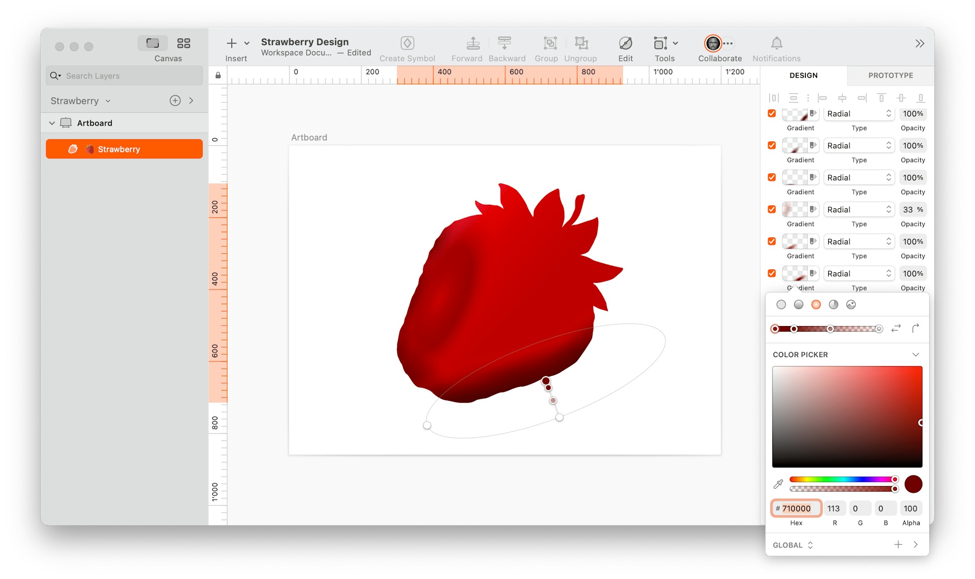
Play around with the in-betweens to your liking, but make sure it’s progressive.
5. Fill the leaves
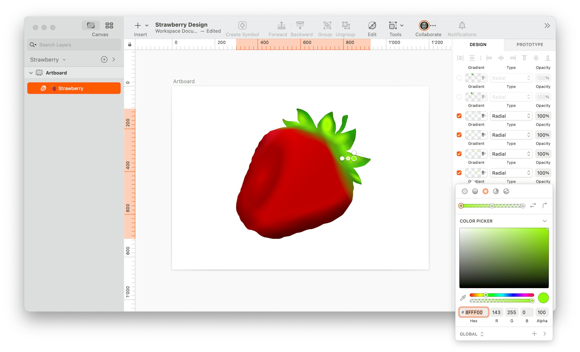
Now, let’s fill the leaves and stem with small green gradients. Remember to follow the same logic: set the alpha value in the gradient’s first stop to 100 and lower it down progressively to 0.
Here are the green values I combined: #4DBE00, #00BB10, #97FF12, and #8FFF00.
6. Create the leaf structures
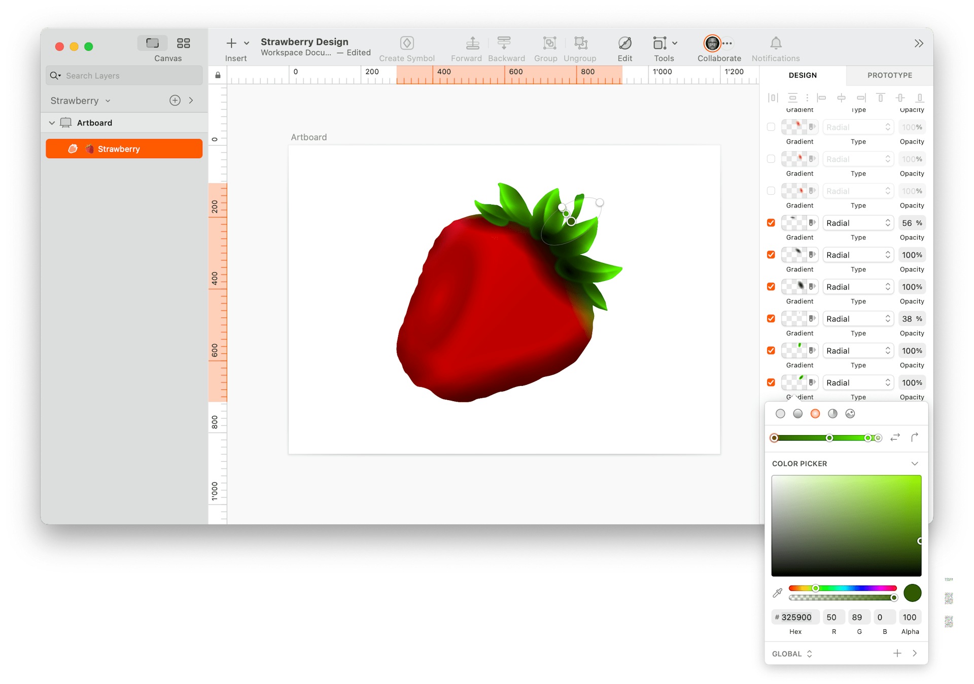
By layering hard-edged gradients on top of each other, you can create a kind of three-dimensional leaf structure. Try out these values: #325900, #218A00.

7. Add depth to the leaves
To give the leaves more depth, layer in additional gradients over the existing ones to darken the leaves towards the bottom. I used #325900, #218A00, #471900, and #000401.
8. Clean up the top edge
To create a clean transition from the strawberry to the leaves, you can place some radial gradients above the area — as you’ll see in the image below. First, add some red gradients using #DD0000. Don’t worry about adding multiple stops for this one.
Then, we’re going to use yellow tones to blend the area where the leaves meet the strawberry. Stack multiple gradients and use the following values for every stop.
- Stop 1: #C90000, alpha 100
- Stop 2: C94603, alpha 100
- Stop 3. C0A805, alpha 100
- Stop 4: CCAC00, alpha 0

9. Blend back the top
The previous step probably left your strawberry looking a bit blotchy. To smoothen out the colors, fill the strawberry again with radial gradients — adding stops from red to transparent.

10. Add some shine
To make our strawberry a real showstopper, add in a few white radial gradients. Make sure the stops decrease progressively until reaching alpha 0.

11. Make the shine organic
To make the shine a little less geometric, cover certain areas again with red gradients. This way, you’ll end up with more realistic shapes.

12. Create shiny contours for the seeds
No strawberry is complete without its seeds, and those seeds will need their own shiny glow. This is where the hard work begins. Use radial gradients — going from red to white — to create some elongated O’s. The goal is for these to work as the shiny contours for the seeds.

13. Add in the seeds
It’s finally time to add in the seeds. Create oval radial gradients, giving the center a yellow color and darkening the outer edges to give a sense of depth. When placing them, make sure to partially cover the glossy edges you created in the previous step. To give it a more finished look, add in some extra highlights to some of the exposed seeds.

14. Fill the stem
Last but not least, fill the stem with brown-green gradients to distinguish it from the leaves.
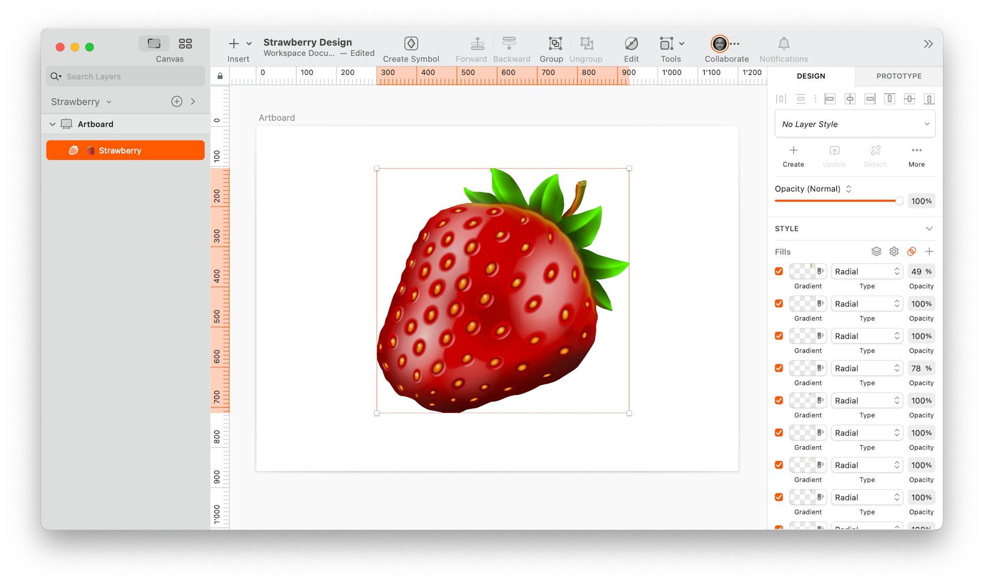
You can also give some depth to the tip of the stem with another radial gradient as I’ve done here.
15. Add noise
The strawberry is pretty much done, but I’d suggest adding a noise overlay to polish the look. Add one last fill and switch to the Pattern Fill tab. Then choose one of the included noise textures, set the opacity to 8%, and add a Multiply blend. This will give the strawberry a more natural texture. Depending on the size of your strawberry, you may also want to change the Type from Fill Image to Tile Image to reduce the size of the noise a bit.

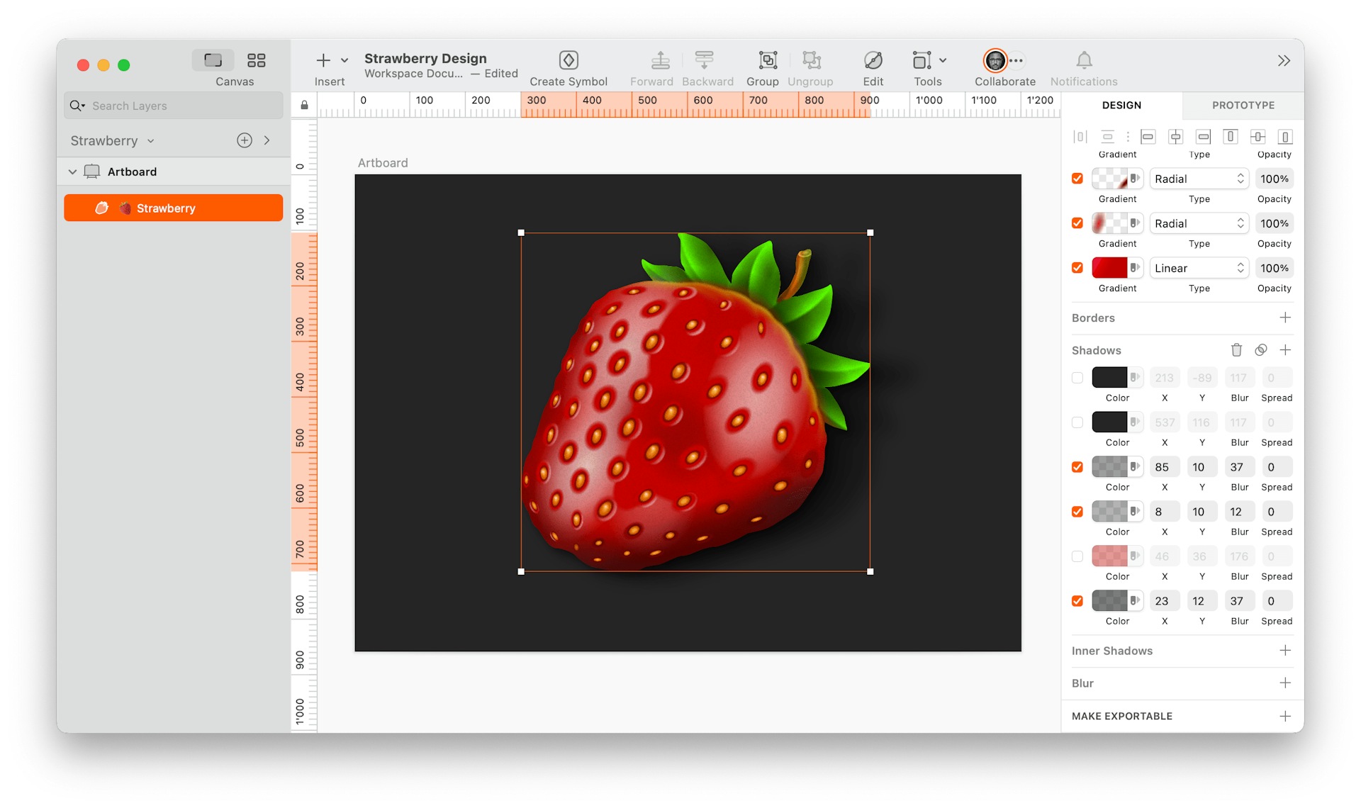
16. Add a background color and shadows
This step will depend on your personal preference, but I added a background color to the Artboard (#252525). Then, I applied a few shadows to the layer with different opacities and blurs to help the strawberry stand out.
17. Add a reflection
You can also generate another shadow layer to serve as a reflection of the strawberry color. Then, overlay the shadows and reflection with additional shadows on top that have the identical color as the Artboard background (#252525, in this case).
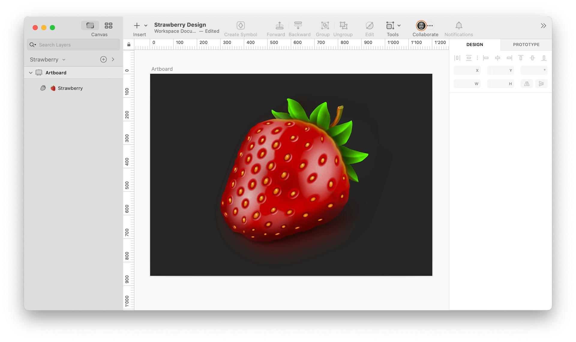
There you have it — a delicious-looking strawberry illustration created in Sketch using just one layer. Great job! 👏🏻
If you like what you’ve created, we’d love to see it! Share your strawberry illustration with us on social media using the hashtag #MadeWithSketch. This way, you can showcase your work, inspire others, and connect with fellow designers who also enjoy using Sketch for their projects.
Remember, practice makes perfect, and the more you explore and experiment with Sketch, the more confident and skilled you’ll become in creating various illustrations and designs. So keep up the good work, and happy designing!
David Blum is a product designer based in Switzerland and our One-Layer Design Challenge winner. You can find him on Twitter or LinkedIn.


