Made with Sketch: How Gavin Nelson puts the “icon” in “iconic”
“There are so many little quality-of-life features and design choices in Sketch that really make designing icons a joy”
When we saw Gavin Nelson’s skeuomorphic mobile icon designs on Twitter, we loved how realistic the stitched-leather effect looked. We knew we had to reach out for a conversation.
You’re about to get a close look at Gavin’s approach to icon design, his love for skeuomorphism, and his creative tips for others in the field.
Tell us a bit about yourself. Have you always been a designer?
I’m a product and icon designer currently living in San Diego, California. I remember first becoming interested in design through app icon design when I stumbled upon MacThemes back in high school. I had this moment where it clicked that the icons I was looking at on my Mac were hand-drawn by designers. I very quickly became obsessed with figuring out this world of Photoshop and vector graphics and trying to make my own app icons.
From there, my interest in product and icon design turned into a passion. And after graduating from college, where I focused on Human Computer Interaction, I began working as a product designer and making icons for fun as well as for freelance projects. I’m currently working as a product designer at GitHub on mobile apps and still love making app icons all these years later!

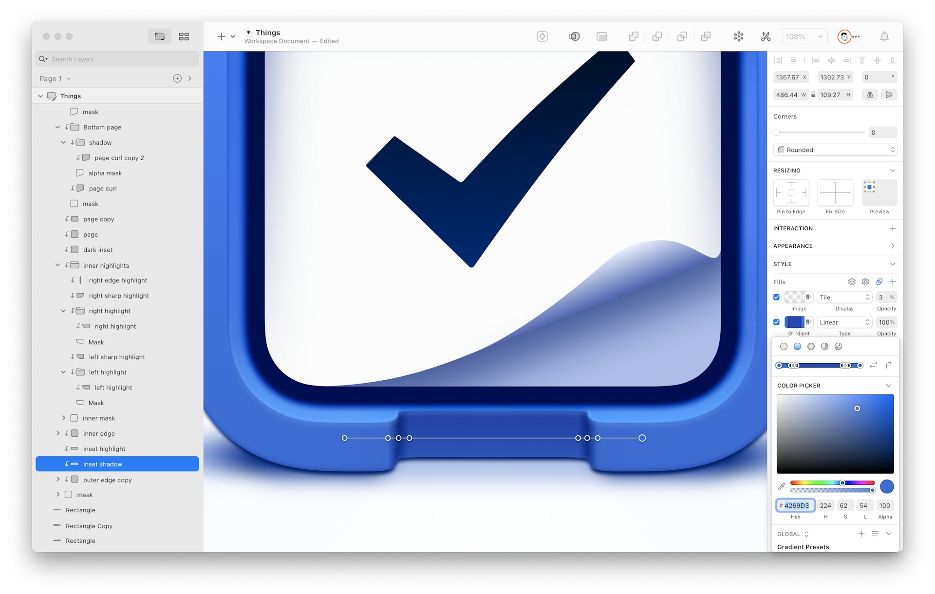
As a personal project, Gavin redesigned the Things icon for macOS.
How has your approach to icon design changed over time?
I’m always trying to make incremental improvements and learn something with each icon I make, which has resulted in a lot of tiny changes to my approach over time. I’d say the largest change in my approach and techniques came from learning the basics of 3D design.
Even though I still render most of my final icons in a vector format in Sketch, having a 3D reference for perspective and lighting has directly helped me compose icons. Indirectly, studying existing icons, recreating them, and working with 3D tools have fundamentally changed the way I think about the details in icon design when I do get into Sketch to start drawing the final version.
What are the challenges involved with developing these icons?
There are many little creative challenges involved in icon design, which is why it can be so fun! Icons should be a recognizable symbol for your app, give a good first impression, scale well to different sizes, have good contrast ratios, and more — all unique challenges.
When I zoom out a bit from the details and look at the challenges of the whole process I generally see my work in two overlapping phases:
The first phase in my process is a lot of sketching, ideating and researching to get a few good concepts for the composition of the icon. This can be a challenge for a whole variety of reasons, but in some ways, it’s the most important part of designing an icon. You can do a beautiful, detailed rendering of a poor idea for an icon and it likely just won’t be that great of an icon.
The technical rendering itself is the second phase. This is where I turn to 3D tools and Sketch to create the final piece. Even after making tons of app icons, I still hit new challenges trying to execute the idea, especially when going for a more skeuomorphic, lifelike style. I like to think that every detail in an icon creates a whole that is greater than the sum of the parts, which means creating a great icon comes from challenging yourself to really nail every little highlight, shadow, color choice, etc.

When designing icons in Sketch, Gavin takes full advantage of the Layer list.
Can you give one piece of advice to designers struggling with creative icon design?
I’ve talked about this on Twitter before but it’s worth repeating: I’m a big fan of learning and practicing through reproducing existing icons that resonate with you. Recreating an icon from scratch forces you to really study the details and understand what specifically makes it work; what makes it great. Eventually, you can use the details and techniques you discover through this practice in new ways and shape them into your own style.
I’m a big fan of learning and practicing through reproducing existing icons that resonate with you. Recreating an icon from scratch forces you to really study the details and understand what specifically makes it work; what makes it great.
I began icon design right around the peak of brushed metal, wood grain, astroturf, and leather interfaces and I’ve always found skeuomorphic design to be a fun challenge. I think it was all the intricate detail and photorealistic shadows and highlights that got me interested in the first place! Now, I try and strike a nice blend between the old, super realistic skeuomorphic icons, and a more refined, stripped-back icon that works better in context. When you get it right, it doesn’t look out of place, but still hits this nostalgic chord, which I think is part of the reason it resonates with people.
Since GitHub Mobile defaults to a more immediately recognizable brand app icon, I’ve got the luxury of experimenting with new (read: old) and fun styles for alternative icons to delight our users. I feel really lucky to have the space on the Mobile team to break from difficult product design problem-solving every now and then and get some creative icon design flowing.

Gavin went for a stiched-leather look when designing Find and Replace icons for GitHub.
Now, I try and strike a nice blend between the old super realistic skeuomorphic icons, and a more refined, stripped-back icon that works better in context.
There seems to be an endless debate about whether the skeuomorphic design trend is dead or alive. Where do you stand? What are your thoughts about the trend?
I’m not sure I’d really call it something that is a binary dead or alive. I think that as we have become more familiar with digital tech concepts, our need for skeuomorphs in interfaces has waned. When Apple shifted the interfaces of their products from heavily skeuomorphic to “flat”, I think the pendulum swung a bit too far to the other end. Now you see a more moderate amount of skeuomorphism returning in some ways, which in my opinion, is a good thing. There are more shadows and highlights being used in interfaces as a way to stand out from the rest. But also, there’s a functional utility aspect to skeuomorphism in terms of communicating affordances and z-axis hierarchy, which can really help add to a user’s understanding of the spatial mapping of the interface.
You mentioned that you’ve been designing icons in Sketch because of your positive experience. How does Sketch help you in your design process?
There are so many little quality-of-life features and design choices in Sketch that really make designing icons a joy and greatly speed up my workflow compared to other tools. The vector editing is top-notch — being able to quickly toggle between point styles when drawing with the pen tool — with 1,2,3 and 4 — is super handy. I also find adding and adjusting points on a path to be really snappy.
The Inspector’s UI is another thing I love about Sketch. It’s designed to clearly show you all the defining characteristics of a layer’s style without needing to click into sub-menus. For example, each stitch in the two leather GitHub Mobile icons I recently shipped had 12+ layer styles. But with the signifiers included in the Inspector’s UI, it was easy to identify exactly which style needed editing as I was creating the icon.
Some other small details like always having HEX values and HSLA values one click away, only needing two clicks to flip or rotate gradients, and having multiple strokes, are huge quality-of-life improvements as well.

Gavin used over 12 Layer Styles for each stitch in his leather-looking GitHub Mobile icons.
What‘s the one plugin, Library, or tip you would share with anyone who’s new to Sketch?
I actually don’t use any plugins for icon design in Sketch at the moment, but I’d highly recommend everyone learn the keyboard shortcuts for common actions. This will speed up your workflow and allow you to focus on creating rather than clicking around the interface.
Here are some good ones to start with:
| R | Rectangle |
| O | Oval |
| P | Pencil tool |
| V | Vector tool |
| 1,2,3 or 4 | Switch between vector point types |
| ⌘[ | Move backward |
| ⌘] | Move forward |
| ⌘G | Group |
| ⌘ShiftG | Ungroup |
| ⌘ShiftH | Hide and show layers |
| ⌘ShiftL | Lock and unlock layers |
| F | Fill |
| B | Border |
Sketch also has some great, niche tools for editing like Rotate Copies. Definitely investigate those as well.
To wrap up, what’s been your favorite design project at GitHub so far? Or what are you most excited about working on?
There have been so many exciting projects shipping at GitHub recently. The developer tools space has many unique characteristics and opportunities that lend themselves to a seemingly endless supply of challenges and problems to solve.
A recent favorite I worked on, that actually has some overlap with the design principles of the Inspector, was GitHub Mobile Shortcuts — a new feature designed to give you the fastest access to filtered lists of Issues, Pull Requests, and Discussions right on the Home tab. Much like the Inspector that pulls relevant context about a layer right to the surface, Shortcuts let you create lightning-fast access to the content that is most useful for your productivity. It turned some 5-10 tap workflows into a one-tap workflow and we’re looking to make further improvements in the future! Keep an eye out for some exciting secret projects landing in GitHub Mobile in the coming weeks as well. 👀
Follow Gavin Nelson on Twitter and on Dribbble to keep up with his designs and creative tips.


